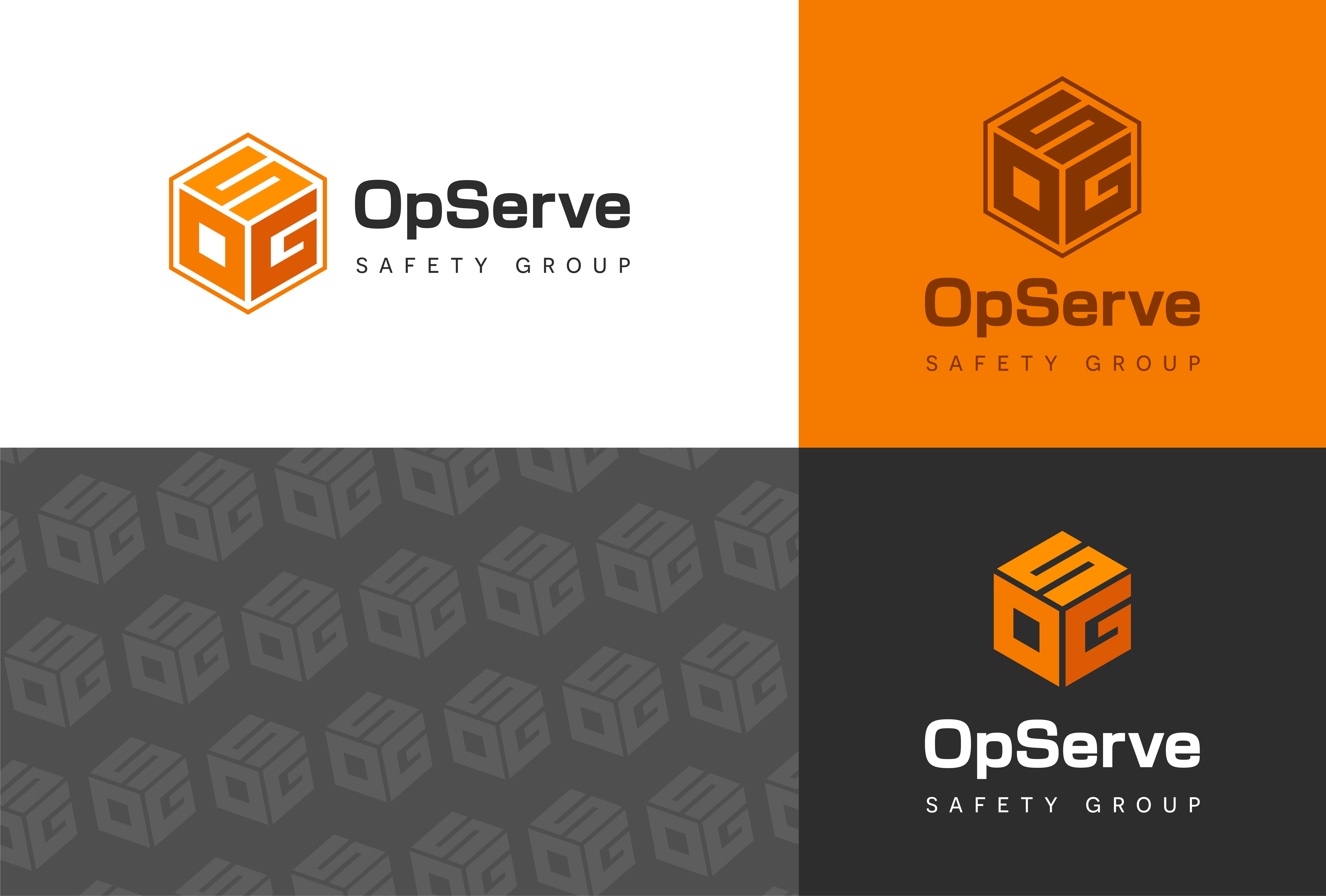
For this project, I developed a brand identity and logo design for OpServe Safety Group, a security company looking for a modern, clean logo. The client wanted to incorporate OSG into the design, using a black and gray palette with a warm accent color like red or orange to stand out in the market. I created four design directions, each exploring bold typography and the use of warm color to create contrast. The client chose the first direction for its strong typography and simple, yet distinctive look. This logo design helped OpServe Safety Group establish a modern, professional identity that stands out in the security industry.